Projects
This is my current portfolio; where I display my work and skills as a front-end web developer.
On this page, not only do I display my work; but also describe my thought process And explain how I got to the end result.
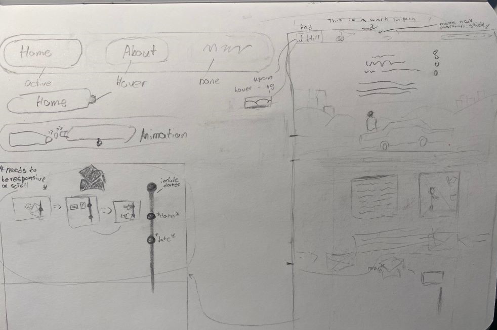
This is an image of what I initially sketched out for what to display on my homepage. I figured it would tell the story of how it got me to be where I am today and share some bacground of who I am; but after looking at YouTube videos of people critiquing other portfolios and seeing basic videos of what should (and shouldn't) go on your portfolio, I figured I would be was sharing too much unneccecary info about me. It was still fine to draw out because I then thought that it's something that I could put on my About page instead.
It does have some things that you do see on the homepage right now; like the nav bar on the top left of the sketch. I dreamed big and wanted it to be animated and something that people can admire for the effort and small detail that was put into this portfolio; just like how I went through making a little background for when you hover over the "J Hill" "logo".
After Watching videos and thinking about a creative design, I came up with an idea, sketched it out, and asked ChatGPT what else goes in a portfolio.
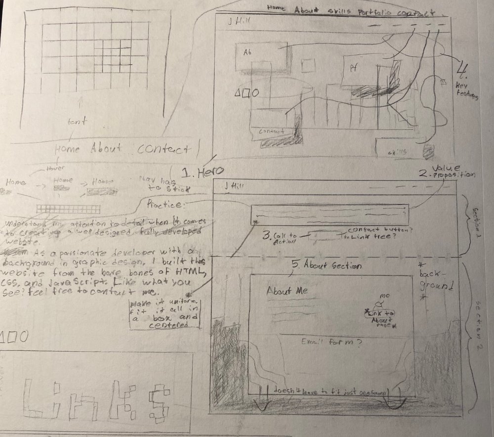
You can see here how I was trying to go for more of a pixelated look, with a beginning screen of all the links floating around in front of a hero that I would've created. I also showed the first five elements that ChatGPT told me to have for a portfolio.
After I got the basic layout built in the webpage, I didn't understand what I was thinking for having the nav links not only be shown twice in the same screen, but also the fact that it's the first thing you see and that it takes up the whole screen; so in other words, I thought it was a dumb design flaw that I didn't realize till I actually built it out.
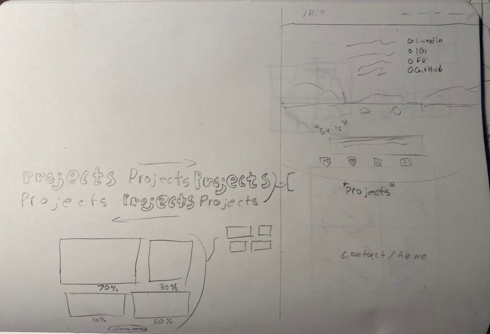
After thinking about another design, it wasn't long for me to go back to the design I was using before but tweak it a little and sort of encorperate both designs together.
Then, after some time away from working on this and more insight on portfolios and examples of other portfolios that got a job at big companies (using Cofolios), I saw how little people displayed on their portfolio. So that's what I did; I cut out the about me and skills section and only had my homepage display my welcoming screen and handpicked projects. It was convenient because at the end of the page, I also have a place for the user to navigate to my About or Projects page.
The footer came naturally; I used haikei for the complex shape and added all the content I wanted, in the layout that I had in mind :)
From there, I had my layout for the homepage done. I then needed to finish my About, Projects, and Contact page.
I already had an idea of what I wanted to do for the Projects page and it was already being worked on while finishing the homepage, so that's what I focused on next.
One thing that I did know while working through this process is that I wanted a plain white background. Although it isn't completely pitch white, it still gives the purpose I had in mind of it looking like a blank sheet of paper with notes explaining the procvess behind whatever is being shown or explained. I also want it to have many photos to show and tell why I did what I did. I didn't want the size of the image to take up too much space with such little text. I wanted it to be easy for the reader to not have to scroll down a whole page to view the next few lines of text; but I also wanted the images to be seen clearly, so what I did was give the images a hover state so that when someone hovers over the image, it will enlargen that picture for the user to see it more clearly.
Although I didn't have images to display for every project already, it was something that I needed to keep in mind for future projects.
After putting in all the content for the projects, getting the right sizes for the images to show and choosing how big I want them to be when hovered, I had the basic layout for how I wanted to display my projects process.
From there, I knew I was almost done with my portfolio. I figured I would make my page short and direct to show and talk more about me. Before I even started the process, I wanted it to look fun and colorful and pop out by using trend that are coming into 2024. For my contact page, I figured it would be like one of those linktrees that I see people have that just has a page that only displays links to their social media, github, email, etc. in the body tag.
The first thing I started with was the contact me page so that it is something that gets done and is out of the way. Like I said, my approach to this was simple. Have a page that has big buttons that direct the user to a different page. I just had to know what links to put. When asking ChatGPT, it gave me some insight on what I should put. One that struck me was to include Behance especially if the portfolio is aimed towards designs. For me, I don't have any current work on my behance so the work you see in my portfolio is all new.
One thing I did realize after being done with setting up the whole Contact page is that I would like there to be more done to it. I would want there to be some sort of background like the icons of the apps floating around - just so that there is more to look at instead of a boring column layout. One thing that caught my eye was going back to a saved post on Instagram that talks about animated text on Typeface Animator. One of the animations did look cool but it didn't give the option to export the animation. There were others that were avaliable to be exported but I didn't think that they would look well on the page. So instead, I thought about it and figured that I could just make an animation myself when I get to it.
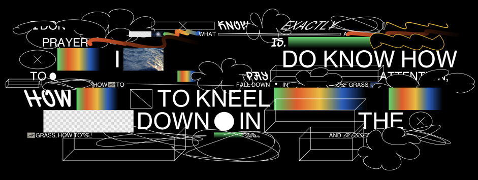
Speaking of getting to it, it was finally time to start designing what I wanted my About page to look like.
While I was looking at the text animations website, I came across this design that had this crowded space of gradients, GIFs, strokes, and a GIF or animation of these squiggly lines changing every second or so. I thought this was a cool layout so figured I would want to encorperate it into my about me page.
After a break from working on this and coming back to it, I thought about the idea, and still wanted to encorperate it in my portfolio, but I also thought about another portfolio I saw that showed multiple pictures of them. I thought that would be a better thing to do because it shows, well, me. Initially it would have been just one picture of me with a bunch of other shapes but I thought, why not have a main image and then other smaller images floating around to show more of me! So, I went through my camera roll, picked out some photos of me, opened photoshop to add the glow around the photos, and placed them into the page!
For this project, our mission was to create a front-end application. We had to use some sort of CSS framework other than Bootstrap (for this project we used Bulma), use at least two server-side APIs, make it responsive, have a polished UI, and have a quality README in the GitHub repository.
I was in a group with three other people and decided my role would be in the front-end side of the website, deciding how the website looks and how people interact with the application.
Initially, it was challenging to come up with a good idea on what our project should display due to the limited amount of (free) APIs. First we wanted to make something that would make decisions for you, then we thought of a travel app that would give you activities to do in the trip you're planning; it wasn't till the next meeting that we found an API of food recipes and a GIF API to go along with it.
I had a very basic wireframe that had a huge hero section that would display the random GIF and inside the hero it would display a menu of options to choose from. It had very bland colors at the start of the project but then around the end of it all, I messed with the colors and where the GIF should be displayed, showed it to my group, and gave positive feedback to the new look.
The room for improvement for this project would be small user experience changes; like for examle, needing to click on the picture of the food item you want to be directed to, in order to see the recipe. Other feedback we got was to not display links in the header like History and Services, if they don't direct you to another page at all.
Overall, it was a wonderful project to get to work with others and use git and gain experience in merging branches with other partners. It allowed me to learn more CSS skills and get feedback on what to do differently next time.
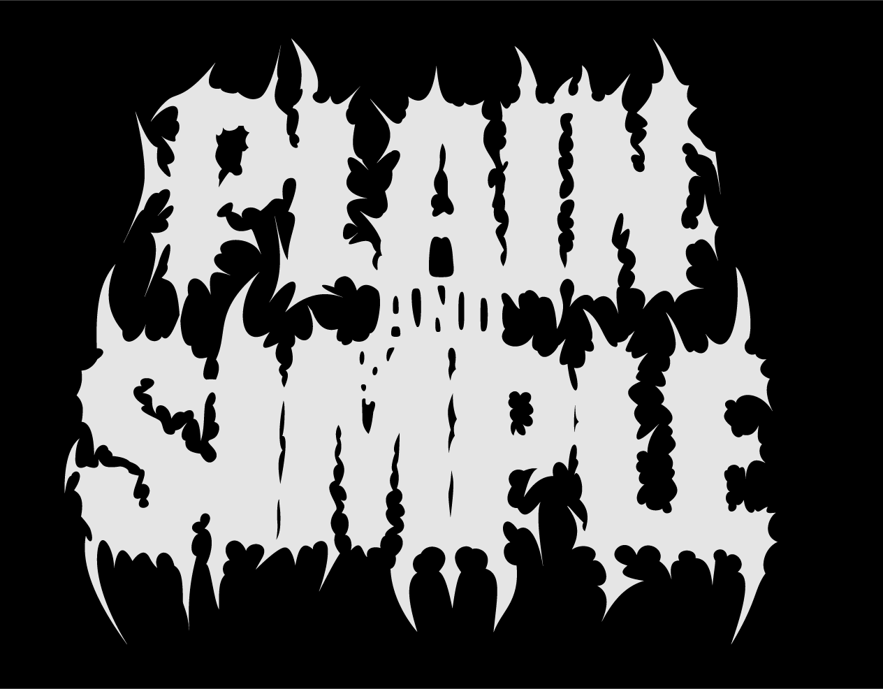
Plain And Simple started from a simple post I saw on Instagram made by casketnap. The style he made the text was something I recently got interested in after listening to more heavy metal music and seeing that barely readable, if not, unreadable text in the album covers. I would also get cool fonts people can use or download in certain websites too, but I never really bothered to use any because in the end, if you used the same letter twice, then they would be identical to each other which defeated the purpose of the style in my eyes; so after coming across that post and seeing the process the artis goes through, I wanted to try it myself! I didn't bother to put much effort in coming up with what word I would use. I thought of "PLAIN AND SIMPLE" because of how ironic it was to have such complex and different jagged spikes around the lettering.
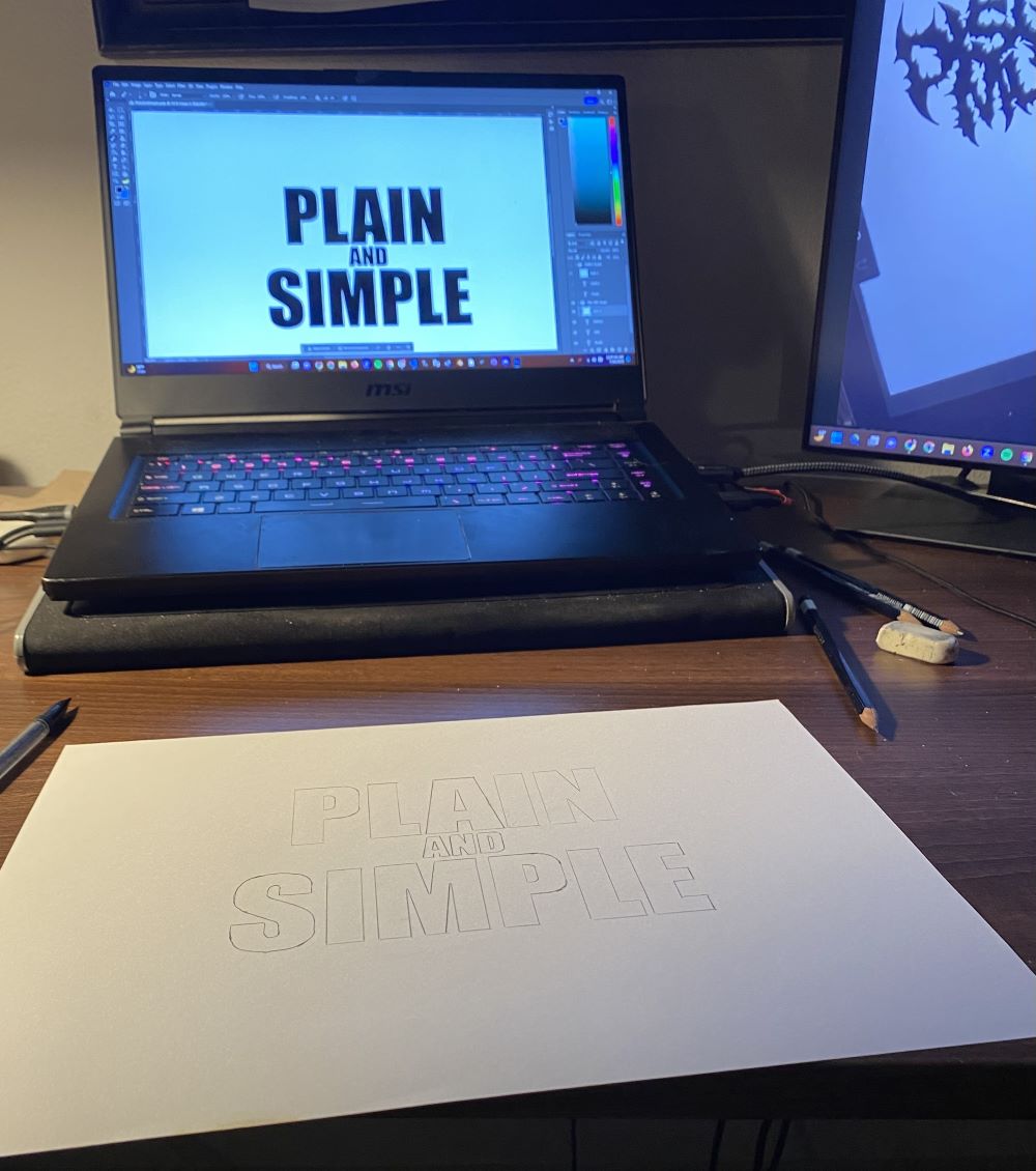
The first thing I did was get my sketch ready on a piece of paper. There is something about working hands-on onto a piece of paper that makes things much easier in my oppinion. What I did was go into Photoshop to get the words placed where I want them, and then I laid my piece of paper over my screen with all other lights off, and started outlining the letters ToT
I found this method to work best for me so that I have the exact measuments of lettering and spacing between the letters and each word. It was also going to come in handy later for when I take a picture of the sketch and then put it into Illustrator.
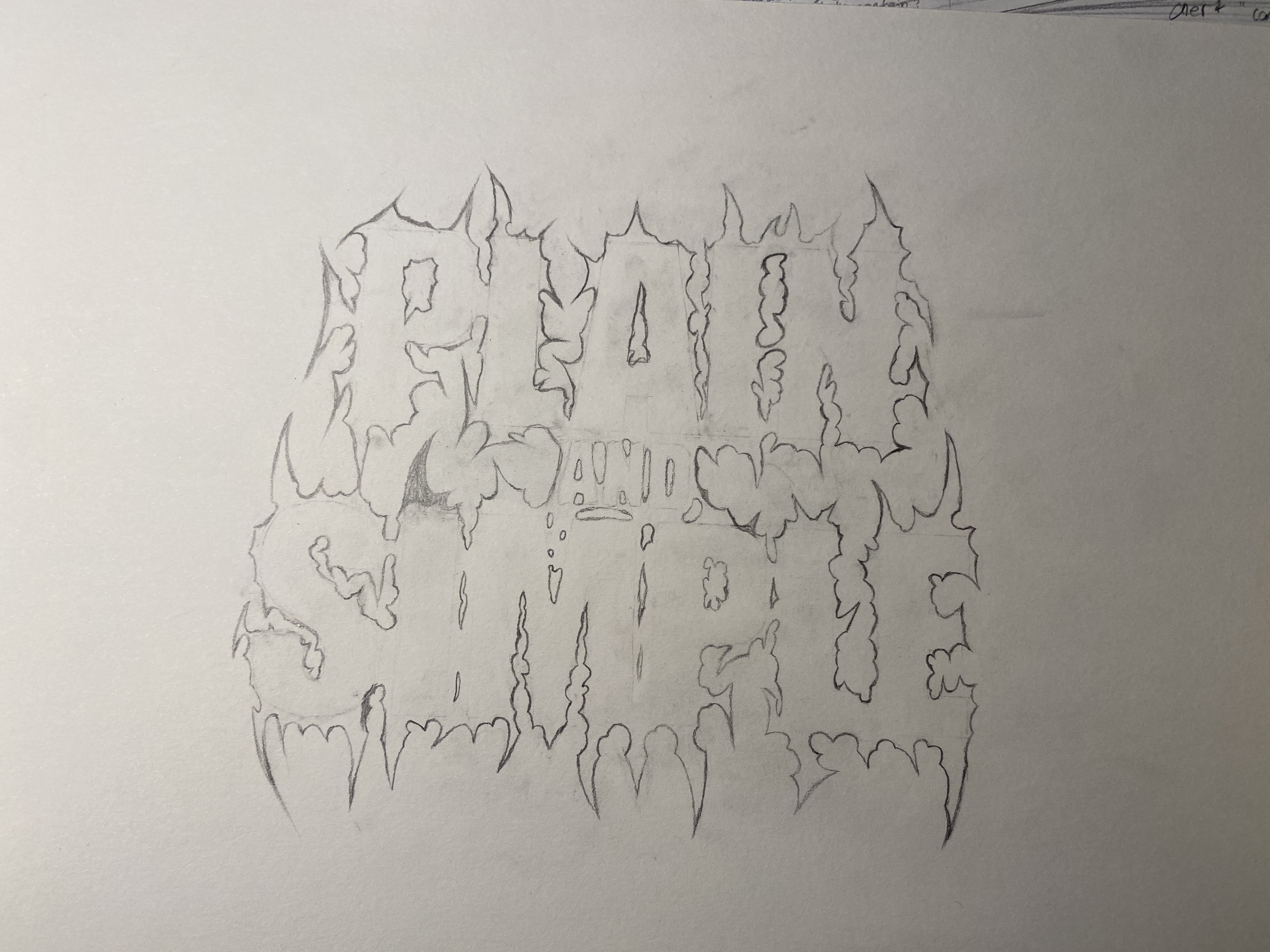
One thing that I didn't bother to do while grinding out the design over night was take pictures throughout the process. This is the picture I took to use it as an Illustrator background. Two things you can clearly see here is that one, I don't have the A finished, and two, there was a large bubble under the AND. I don't really know what I was going for there but after adding it in Illustrator and then looking at it on paper again, I ended up immediately deleting it. I wanted the AND to look organic and like the words "PLAIN" and "SIMPLE" were being pulled away from each other so I used the negative space to be like bubbled tears that made the word "AND".
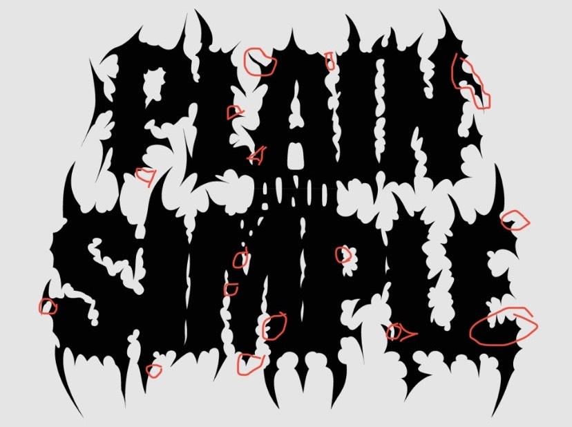
Plain And Simple wasn't all that simple. After completing the design, even though It doesn't look the same as casketnap's end result, I still liked it; so it grew to my liking and I would look at it a lot and find small details that I didn't like. it got to the point where I went ahead and circled points of error or curves that I wanted to "fix".
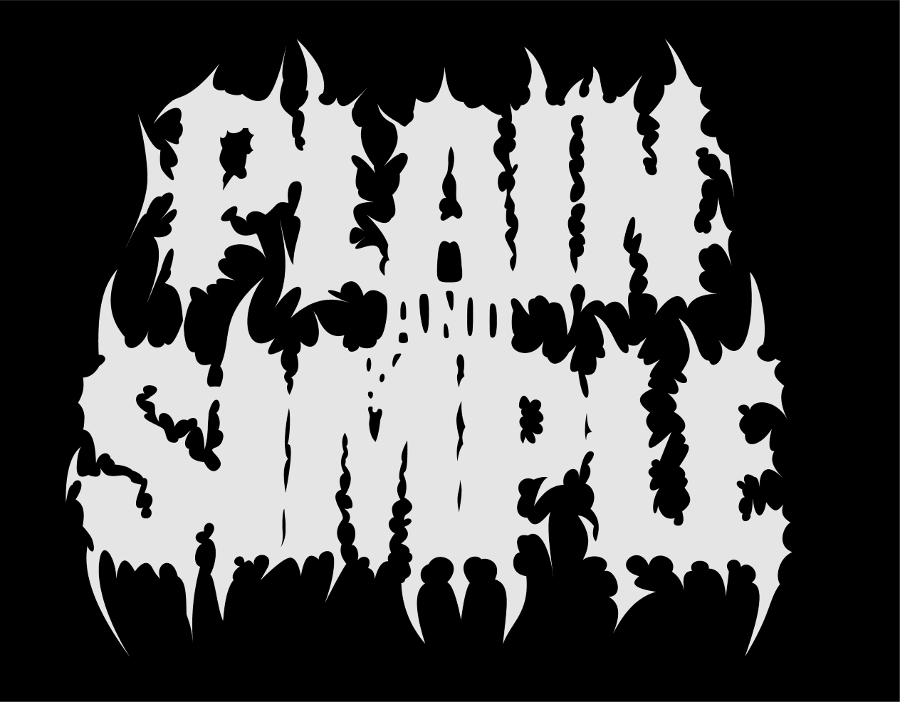
Please be patient as this project is still being worked on :)
One thing that I can say, is that the preview pic is nothing like what it really looks like. If you would like to see what I have so far, then click this link to see what I have so far. Going through the process of making this website was all design decisions made on the spot.
I did have some ideas for what I wanted it to look like but not all of the plans were put onto the website.
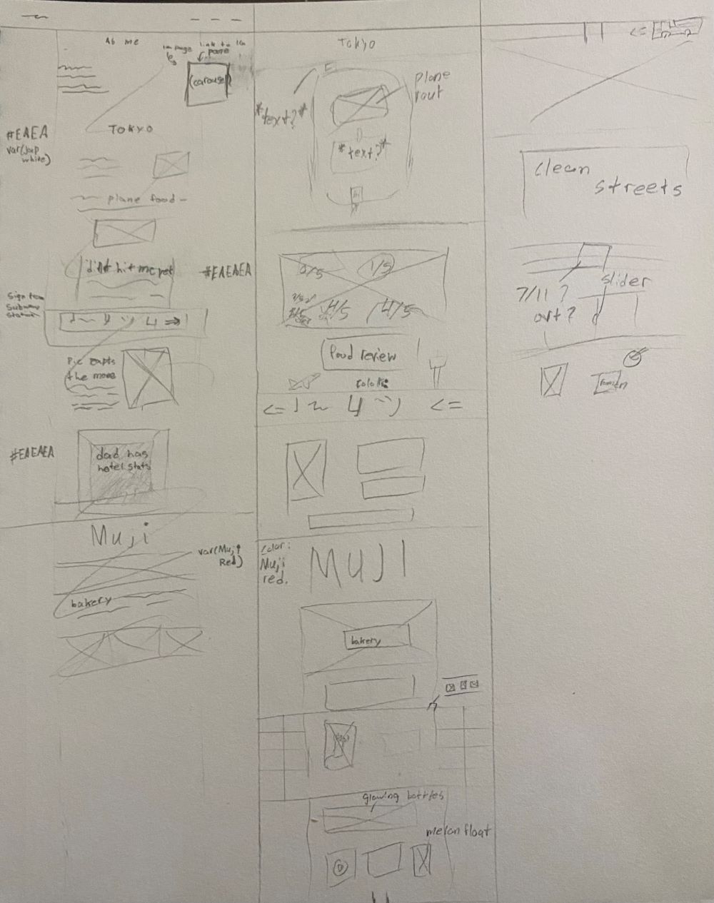
This is the only sketch I did for planning the webpage. You can see that I ever so lightly scribbled over the left column and started over XD
One thing that I did want to have from the start was to have the background always be changing; weather it was a photo, video, pattern, anything - it had to keep the reader visually engaged with something always new to look at. What I did to be absolutely certain that there was a background, was apply a pattern to the whole body so that if I see that pattern, It's an immediate alarm to me stating that there isn't anything new in the background.